HOME trend report | pantone of the year 2020 | classic blue
CLASSIC BLUE | HOME
Inspired by the deepest ocean and the bluest of skies, Classic Blue finds its way into our homes through most forms, from the more traditional patterns, handcrafted stone wear to full tonal rooms replicating tranquil spaces. This colour allows for subtle shades and tones across the application of material and texture, making for easy application. Symbolizing trust, confidence, faith and understanding what better energy to bring into your home.
Image credits: Pexels, Pinterest, Unsplash, Architectural Digest Russia, West coast indie, Aboubakar Fofana, Hungry ghost, Vogue, Greg Natale, Williams Sonoma, Arnout Fonck, Michele Michael, Elephant Ceramics, Lisa Junius
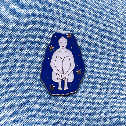
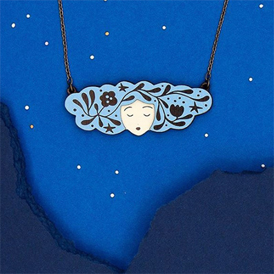
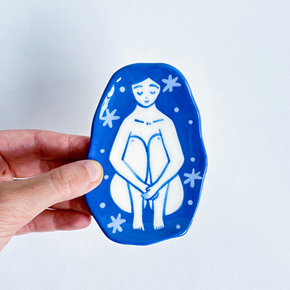
product feature | lisa junius | luxembourg

HOME trend report | HOME
OUTSIDE IN
Craving for freedom that nature gives, homes are our only escape and sanctuary. Greenary is creating oases of escape spaces at home to design areas of calm, that escapes daily routine whether on balconies or in bathrooms, it is becoming essential. The ability to care and nurture, watching life grow, allows for giving back to a world so in need of it.
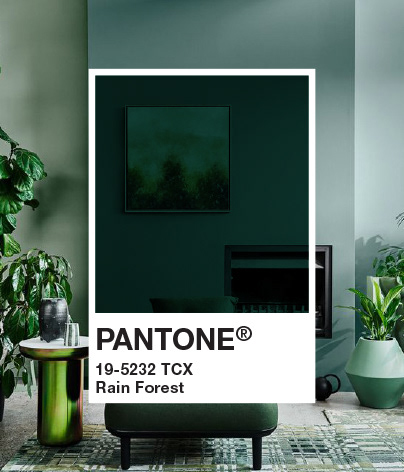
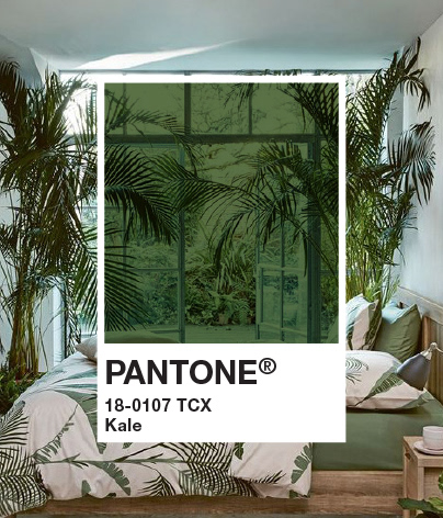
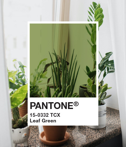
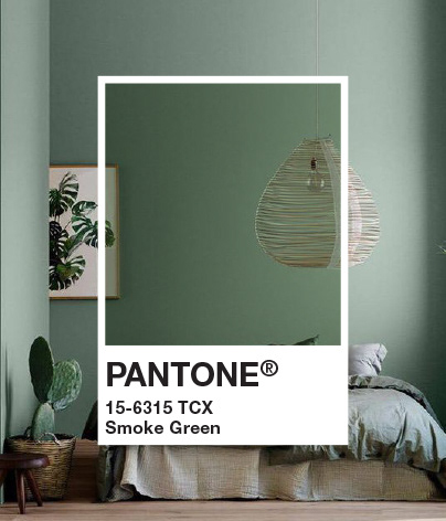
Image credit: pinterest, instagram, architecture.gartenlove, homeexin, google, alexandcorban, theultralinx, Hajallily, society6, glamdecoor, ikea, shelterness, kliefrancis, dwell, pexels, thedesignfiles, eclectictrends,bofred
EARTH TEXTURES
Inspired by the feeling of sand under your feet and the smell of wet soil. Textured soil and rock, influence wall textures, colours ranging from rich rust to soft sand tones, teamed with natural raw wood sourced from your environment, encouraging once-off pieces produced locally. Forms move to smooth edges and organic shape with and is offset with sheer fabrics to keep the feeling of wind and movement.

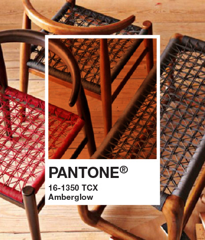
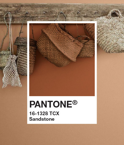
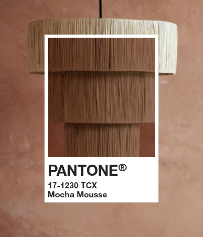
Image credits: pinterest, alexiscstudio, pradamarfia.tumblr, etsy, westnyc-home, thatscandinavianfeeling, @ttayfuncengiz, throughdreamsintheair, ilink, bedroomdecortips, rocks.christmas-desserts33, flickr, fccsanrafael, tollens, sightunseen, pexels, fabricofmylife, Robyn's Egg Studios, bedthreads, brit, pufikhomes
COMFORTING TONES
A need for colour, pushes out the stark white, introducing soft subtle shades from shadow greys to mid pastels. These colour are loosely applied to bare open walls to create areas of self-expression, the feeling of “this is my space”. Surfaces have more texture, allowing for a DIY feel. Daylight is so important replacing heavy curtains with softer sheers, glassware to introduce shapes and patterns showing the sunlight
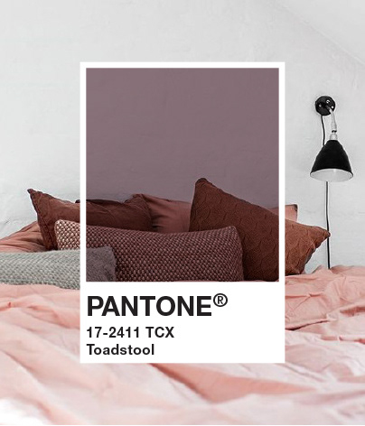
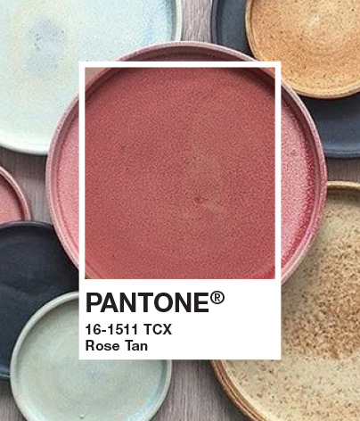
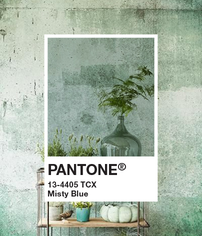
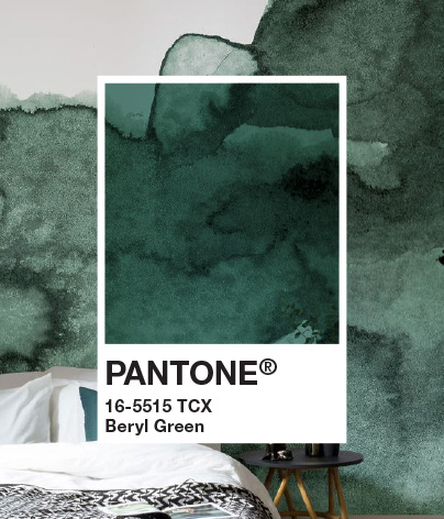
Image credits: pinterest, hana-karim, etsy, setdeco.tumblr, alexiscstudio, gestalten, turbulences-deco, decor8blog, mysteelecreek.tumblr, tableideasdo, pexels, burkedecor, Muralswallpaper, @haymespaint, Keramik.decordiyhouse
